Every week or so I am reminded that not every start-up company has the finances to hire a graphic or web designer. When that happens, small business owners or non-designer web developers have to take matters into their own hands. As a designer (here is some of my work) I get asked questions like “How do you do that?” or “How do you know what looks good?” Rather than replying, “I just know,” I have decided to give a couple of basic web design tips to help the definite non-designers out there.
Here are some general guidelines to ponder before spending money to hire someone like me or a web designer to create or change something in your website design.
1. Alignment and Symmetry
In my opinion, good alignment and spacing is the base of good web design. Friends often ask me how I produce my design work, and honestly, I just line things up and make sure the padding (space around elements) is symmetrical and relative to that particular object’s size. Here are some rules regarding alignment on the web:
- Try not to mix text alignment. Either left-align, or right-align text, but don’t do both. For example, on a normal blog layout right-aligned text in a right sidebar creates rivers of white space between the two columns and looks horrible. If you left-align your body copy, then left-align your sidebar text as well.
- Centered headlines are classy, centered body copy is a definite no-no.
- Use existing hard edges to line up other elements. If your header graphic is 5px from the left edge, then have your body copy be 5px from the left as well. Be precise with it too, in design 5px is definitely not 7px. Remember, good design is all about the details.
- Use balance. What is balance? Balance is the equal distribution of visual elements in a design. Visual balance occurs around a vertical axis and good design needs visual weight to be equal on the two sides. When elements are not balanced, the effect is disturbing and makes users uncomfortable.
Web Design Tips – Bad Examples:

This website is horribly aligned. Notice the left side of the page is much heavier than the right. The fonts are not all aligned correctly and the picture is has no padding (white space) around it like the paragraphs do. The logo in the navbar seems to be floating randomly and would be much better being aligned in the middle and to the left. The information box and button seems to have no alignment with any other element on the page. The footer at the bottom of the page is even aligned incorrectly because it is too far to the left when it should be align with the left side of the containing div above it.
2. Use Amazing Pictures
The right photo can take a good design, and make it even better. The right photo can be the solution to the often used, “Something’s just missing.”
So what makes a good photo? I’ll tell you:
- Relevance – The picture has to have something to do with whatever you’re selling or doing on your website. For example, for a restaurant you’ll want to use photos of the actual business, or your actual food. Bad stock photos will not do you any good, ever. When I have to use stock photos, I use Stocksy because they are stock photos that aren’t really stock photos. When you’re website content is a little less tangible than a restaurant, like babysitting for example, you can get away with using photos that are more symbolically relevant. But if you are selling internationally, symbols vary from country to country, and culture to culture.
- Contrast – Because usability comes first, make sure that the photo you integrate into your design has the right kind of contrast. That means dark background with light text and light backgrounds with dark texts. In web design you are always putting things like text, buttons, or other divs on top of pictures, and there is nothing more irritating than text you can barely read. Using a subtle drop shadow is usually acceptable.
- Attention Drawing – Photos can break up the visual boringness of a site (full of text), and help users to identify an article, link, story, or what-have-you that they might be interested in. If you remember anything from this article, remember this: pictures make people stop and pay attention. This seems almost a little obvious if you think about it but bigger images will have a bigger visual impact.
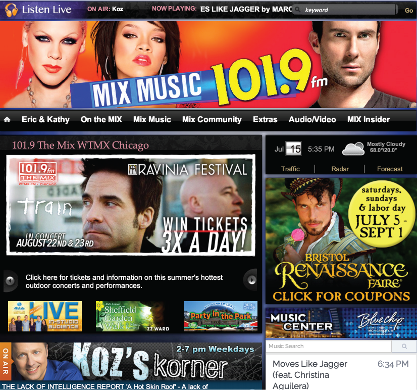
Web Design Tips – Bad Examples:

This is an example of bad contrast and pictures. The photos are not even viewable with the big bulky text in the way. There is hardly any contrast between background and text on the main navbar. The titles are not aligned symmetrically and the 3 columns are not giving my eyes a place to focus on. Not to mention the horrible stock photos. This website is a wreck.
3. Whitespace Saves Ugliness
When I talk about whitespace, I mean negative space. Space between screen elements. Space with nothing in it. Whitespace is not always literally ‘white’ as the title infers. This space may be a color or texture, but either way it is space within a design that does not include screen elements.
Whitespace is a crucial element of design for good reason. If you implement it well it can transform a design and provide many aesthetic or tangible benefits like improved legibility, comprehension, attention, and organization.
Web Design Tips – Bad Examples:
This literally gives me a headache. The quantity of information is unbearable, but the way it is displayed is even worse. Cluttered information makes the user feel lost and unhappy. Do not do it! Give each web element enough room on the page to deliver the message they are intended to. If this website was to divide each call to action into vertical sections with enough white space in between, the website would be completely transformed.
4. Standardize Understanding, But Be Creative in Style, Brand, & Voice
Your users shouldn’t have to read, watch a video, or be taught how to use your website. If they need assistance before they can use it, you are doing something wrong and frankly, they just won’t use it. Instead, they will leave.
While your style, brand and voice should be unique, don’t ever sacrifice understanding for something that may be too hip or too trendy looking. The understanding of your website should be standardized. That is not good design. What I mean by standardized is using clear language, visuals, and structure so your website make sense to everyone. Use familiar actions and interface. Keep items that appear on every page (like the logo and navigation) in the same place on each page so they’re easier to find. Label pages and sections with words that make sense. It’s more important that visitors know how to do something than be wowed with your creative naming.
Web Design Tips – Bad Examples:

Remember that good design is intuitive. Bad design is confusing. This webpage is so confusing that I do not even know where to go when landing on their homepage. The menu on the left is not a standard menu. Even though the website was trying to appeal to their audience with cars as menu items, it is too distracting for the users. The square car pictures to the right of the website are easily confused for the square clickable elements to the left of them. There is no distinction between the two, other than the black text on the clickable links.
Web Design Tips Conclusion
Keeping all these web design tips in mind, create a page hierarchy. When everything is important on your page then nothing is important. Too many large fonts and/or too many words in bold colors actually will confuse your users and makes everything non-important overall. So choose things on your page that are most important and start there. Highlight those elements only.
Hope these tips help out a bit and get your design started off on the right foot.
Happy web designing!